BANG! part one: this is one of my three boxes that I'm making before I leave. I recently played the oh-so-short demo of this on Live and it has to be one of the best games I've ever played (yea, better than Gears). enjoy my boxes while you can.
oohhh very very nice, i really like your choice of colors and the text fits perfectly looks official, and is this a real game, looks like a sequal to area 51
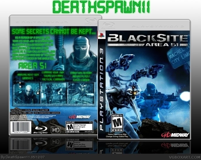
#3, thats cause it is a sequal, the text isn't official but I tried to make it look like the text on the official site as much as possible, and yea it is a sequal to Area 51.
#4, actually, it isn't a sequel to Area 51. There was a developer interview and they asked if this was a sequel to that game, and they said it wasn't a TRUE sequel, but it does take place in the same sort of setting.
Anyways, the box is really good. My only complaint is that they text seems really harsh with all that neon green.
4.9/5
oh yea credit to hellknight to the template, the text, like I said, I based it off the official site which is basically green LCD letters with a glow, but that would've made the text unreadable so I added a dark green stroke to it. anyways thanks for all the comments.
 Blacksite: Area 51 Box Cover Comments
BANG! part one: this is one of my three boxes that I'm making before I leave. I recently played the oh-so-short demo of this on Live and it has to be one of the best games I've ever played (yea, better than Gears). enjoy my boxes while you can.
DeathSpawn11
[ Reply ]
PLZ VIEW IN FULL VIEW!
(^-^)
[ Reply ]
oohhh very very nice, i really like your choice of colors and the text fits perfectly looks official, and is this a real game, looks like a sequal to area 51
[ Reply ]
#3, thats cause it is a sequal, the text isn't official but I tried to make it look like the text on the official site as much as possible, and yea it is a sequal to Area 51.
[ Reply ]
this looks cool, brightening up the front page. :) looks very good, though maybe the green should be white or a light gray...maybe even light blue xp
[ Reply ]
5/5
[ Reply ]
very nice.
[ Reply ]
5/5
[ Reply ]
I do like it, but the green color on the back looks a little funky to me. 4.5/5
[ Reply ]
This is very nice. That font matches the style. Don't forget to give credit to HellKnight for that sweet PS3 template!
[ Reply ]
#4, actually, it isn't a sequel to Area 51. There was a developer interview and they asked if this was a sequel to that game, and they said it wasn't a TRUE sequel, but it does take place in the same sort of setting.
Anyways, the box is really good. My only complaint is that they text seems really harsh with all that neon green.
4.9/5
[ Reply ]
oh yea credit to hellknight to the template, the text, like I said, I based it off the official site which is basically green LCD letters with a glow, but that would've made the text unreadable so I added a dark green stroke to it. anyways thanks for all the comments.
[ Reply ]
Sweet!
[ Reply ]
super sweet fabtabulios.
yeah i just made that word up. great job on the box.
[ Reply ]
i hate bumping an old box, but i find it really ironic how this game was once "better than gears", but now it's "worse than lair" lol.
[ Reply ]
#15, Pfft. I like this game.
[ Reply ]
#16, you filthy animal... you're disgusting. you're a disgrace!! this game is atrocious.
[ Reply ]
#17, Oh, you think every game sucks.
[ Reply ]