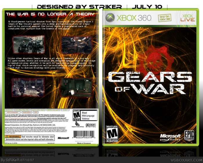
it's not bad actually, the renders are nice but it just seems like random pics thrown together, two pictures of marcus, why? the logo is kinda hard to see in the "A", and you should use the full logo with the skull, and add a drop shadow to it. but it's pretty cool.
 Gears of War Box Cover Comments
i make this very fast :P
plz leave coments!!
Edited at 1 decade ago
[ Reply ]
it's not bad actually, the renders are nice but it just seems like random pics thrown together, two pictures of marcus, why? the logo is kinda hard to see in the "A", and you should use the full logo with the skull, and add a drop shadow to it. but it's pretty cool.
[ Reply ]
Thigs made in a hurry, and things which you believe aren't good, you should post in critiques.
But this isn't bad.
Edited at 1 decade ago
[ Reply ]
I'll upgrade it soon and I'll take more time to do it
#2, #3 thx for comments
[ Reply ]
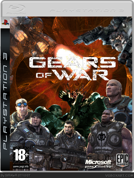
UPDATED !!
leaves more comments plz and I just saw that I put it satire.. I didn't want that so don't told me about this :P
[ Reply ]
Awesome 5/5 + Fav
[ Reply ]
why is this in the PS3 catalogue? It's still good nonetheless.
[ Reply ]
Now it just looks ridiculous.
[ Reply ]
i actually liked it better tha first time
[ Reply ]
Vesion 2 is better than the first, but it is not as good as it could be. 4/5
[ Reply ]
V2 is amazing 4.6/5
Make it into a limted editon and use the tin temp that RB made. on back and front, then would be 5/5
[ Reply ]
its sick
[ Reply ]