![]() »
»
[ Box updated on August 26th, 2007 ] [ original ]
 Spartan: Total Warrior Box Cover Comments
Comment on Dustgunner's Spartan: Total Warrior Box Art / Cover.
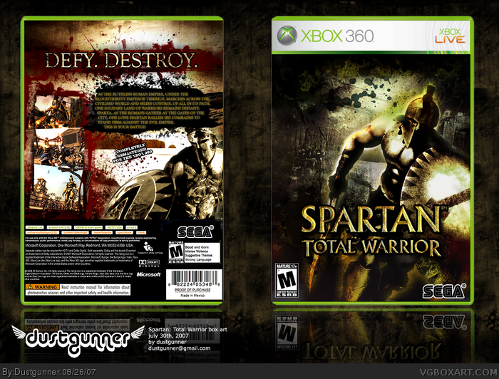
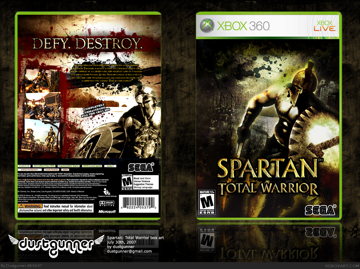
Alright, here's my next box.... Spartan: Total Warrior remade for the Xbox 360. I think that would be sweet.
And yes, I know, it's yet again VERY grungy, but I think this game requires a grunge box - don't worry, a Crysis box is coming up next and it's not grungy at all. :P
I'm not sure about the back on this - I may edit it but I'm not sure what exactly to change about it - but I really like how the front came out, a lot.
[ Reply ]
Tis grungy. But it is great. Just that the text on the back is pretty small to read.
[ Reply ]
I loved this game!
the box is awesome, the back reminds of 300, which is good since the time period of this game is at 300 time
[ Reply ]
Yeah, its pretty much too small to read, but if this was the size of a real box, like a physical copy, I think you would be able to read it fine. :)
[ Reply ]
#4, I guess your right.
[ Reply ]
Okay, I like the idea A LOT - I'm presuming you were trying to emulate the "300" look. Bloody and grungy? It looks cool.
Now the complaints - synopsis text on back is TOO small. I honestly strained my eyes trying to read it.
Also, use the proper sega logo, this black one looks cheesy.
Otherwise this looks awesome. I'm waiting for update 2. :)
[ Reply ]
#6, Yep - a lot of inspiration from 300 here! Glad you like the box...
Okay, I'll update the box shortly with some small updates including the ones you mentioned. :)
[ Reply ]
Yeah what everyone said about the text on the back, I guess the black sega logo would be fine since I don't wanna see anything blue on the front really. Great box overall
[ Reply ]
@#8
Maybe you are right.
Perhaps, a maroon sega logo with a gold outline. It would suit the ancient theme, without clashing with the other colors.
[ Reply ]
This is fantastic!
[ Reply ]
#9, that would be perfect (sure hope he sees that before updating :)
[ Reply ]
Version 2 uploaded - nothing yet done to the sega logo, but the text is bigger.
[ Reply ]
Awesome box 5/5.
[ Reply ]
I like the design but there are some minor things that stand out to me.
First the back. The legal info is rather blurred and is cropped too close to the edge. I had no problems reading the text on the back but i don't like how its staggered. Maybe try centering it or justified left/right.
For the front, with the game title at the bottom along with the esrb and dev logos the top of the box seems sparse. I also feel that the splatters would look better if they were red as everything is a bit too monochromatic for my tastes. Also your reflections need to be flush with the bottom of the box.
These are just minor nitpicks and like i said i like the design. Pretty good job overall.
[ Reply ]
#14, the legal info, I can do nothing about, It's not my layout - if you can find something better that would be great!
I agree about the top but really putting the logo anywhere but where it is would ruin the box. I tried the splatters red but it looked like christmas colors - i prefer the box to be grungy and rough, but still flow.
The reflections are not in immediate contact with the box, true, but this is on purpose - the space in between would be the surface the box is placed on to cause a reflection.
[ Reply ]
Slight update - nothing yet done to the sega logo, still trying to find the sweet spot, but the logo has been slightly raised and I actually think it looks better
[ Reply ]
YES! u freakin legend this is a great idea and one of the best games ever! great box art aswell thank u so much for making it I AM NOT WORTHY!
[ Reply ]
Spartan: TW is one of my fave games, and this is a fantastic boxart for it 20/10 +fav
[ Reply ]
I reeally love this games and your box is so awesome XD
[ Reply ]
I love you, Dustgunner. :p
5/5 +fav
[ Reply ]
Isnt the Spartan onthe front from the poster of the Last Legion movie?
[ Reply ]
Wow fifteen favorites, thanks a lot guys....
#21, nope he's from the game itself.
link
[ Reply ]
#20, I love you too. :P
[ Reply ]
17, see?
also i meant to fav. this sooner, but i got sidetracked with photoshop. haha
5/5
Edited at 1 decade ago
[ Reply ]
#24, you're right!
[ Reply ]
My pants just tightened.
[ Reply ]
#24, see...see hmmmm see what?
[ Reply ]