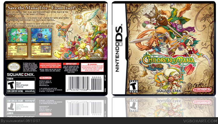
I like this box, the front is a bit blurry but not too blurry that it bothers me so much. The back is also quite nice altough the synopsis text looks very jagged. The colour scheme is very nice as well!
it's pretty awesome and I've just played sword of mana btw and I kinda like the series. For the box the squenix and teen logo are a little stretched on the back and you might wanna consider nudging the reflections a little further down. This is a great box, and I like it. I'll fav if you decide to update with those.
 Children of Mana Box Cover Comments
I like this box, the front is a bit blurry but not too blurry that it bothers me so much. The back is also quite nice altough the synopsis text looks very jagged. The colour scheme is very nice as well!
4.5/5
[ Reply ]
Really nice. It's so clear.
4.5/5
[ Reply ]
nice job.
[ Reply ]
5/5 +FAV
[ Reply ]
Thanks guys, i worked really hard on the box and i'm hoping this time i get more than 4 comments (not including my own)
[ Reply ]
it's pretty awesome and I've just played sword of mana btw and I kinda like the series. For the box the squenix and teen logo are a little stretched on the back and you might wanna consider nudging the reflections a little further down. This is a great box, and I like it. I'll fav if you decide to update with those.
[ Reply ]
#6, agreed.
nice box ^^
[ Reply ]
its really good
[ Reply ]
love this game and you made a really nice boxart of it. great job
[ Reply ]
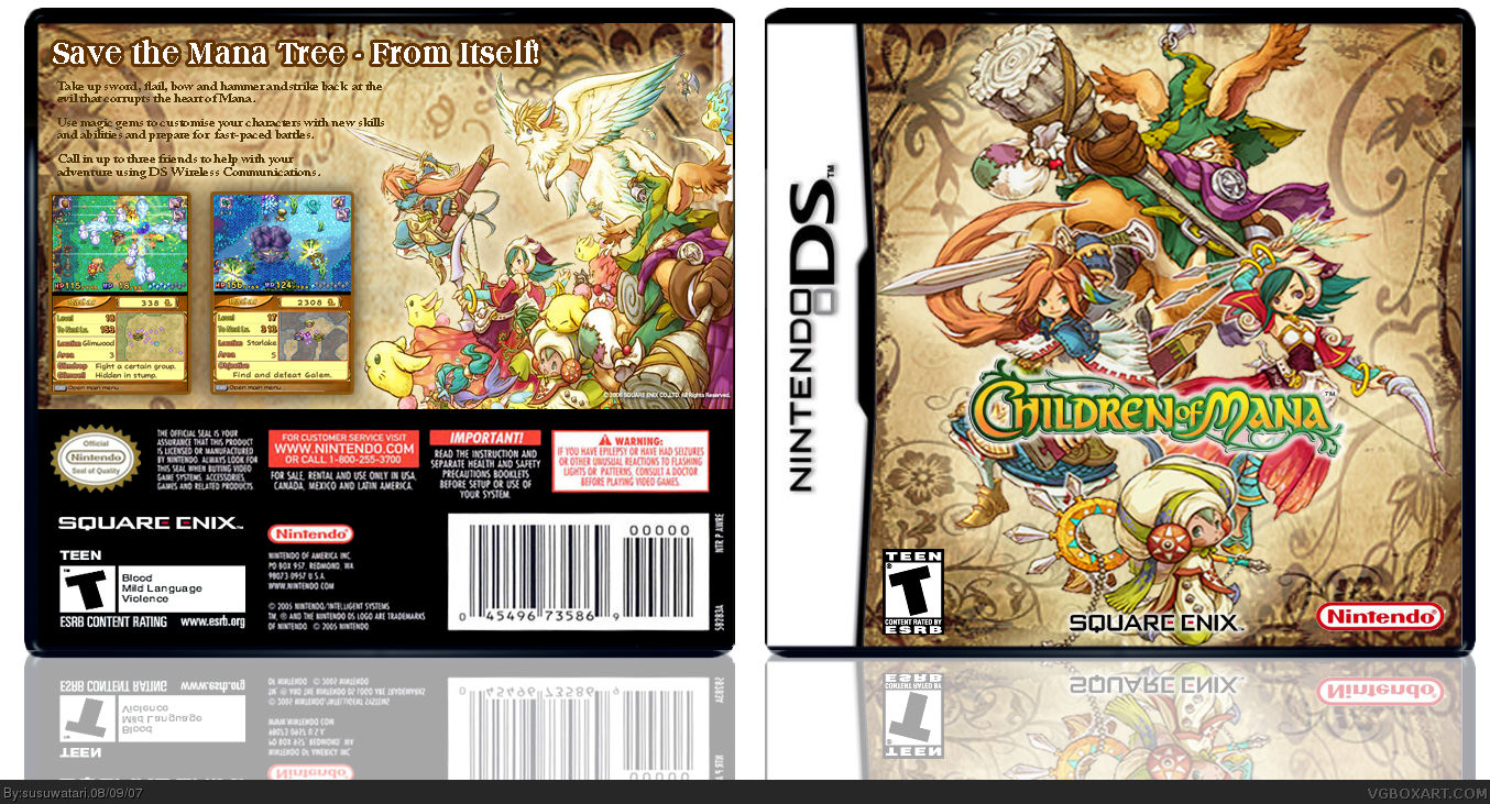
I have updated now, moved the reflection down and changed the text.
[ Reply ]
awesome, glad you updated. faved now.
[ Reply ]
This is very good. I think you did an awesome job with everything.
5/5
[ Reply ]
Edited at 1 decade ago
[ Reply ]
I totally agree! I hope this gets in the HoF. I'll help anyway tho. 5/5 +fav
[ Reply ]
Meh that's beautifull. I agree, this is an HoF deserving.
[ Reply ]
This box is beautiful, except for the font you used for the descriptions on the back. It seems out of place.
+fav
Edited at 1 decade ago
[ Reply ]