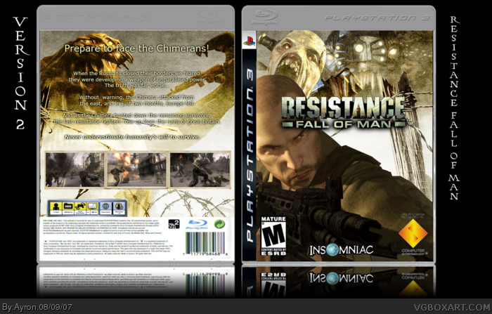
My R:fom box.
tried to go with both the serious shooter type box,and at the same time make it a bit scary, which is the same in the game.
i entered this is the competition against Dark_shadow.
again, i worked my ahss off on this, and i hope it gets a couple comments, which would help me improve ^.^
thanks in progress ;)
The back is good, i like it but i don't really like the front, its that guy, he just looks so bored and uninteresting, then there's the monster behind him looking like its about to eat him and he's not the slightest bit bothered. It just doesn't work for me.
I know, they just dont really go together, he's just too relaxed. I just find him boring personally and its a shame because the box is other wise pretty good.
#6, I think it's also good to keep in mind that material for some games are limited to some point and artists have to sit with that fact and still make a great box. about the box, great job ayron...I really like this one. I could really think of the sony logo being a little stretched to improve, I fav on nxt update. keep it up
Like I said, you are improving. You definitely handled the typography in this box well - much better than you've done in your earlier boxes. Keep up the good work.
 Resistance: Fall of Man Box Cover Comments
My R:fom box.
tried to go with both the serious shooter type box,and at the same time make it a bit scary, which is the same in the game.
i entered this is the competition against Dark_shadow.
again, i worked my ahss off on this, and i hope it gets a couple comments, which would help me improve ^.^
thanks in progress ;)
[ Reply ]
The back is good, i like it but i don't really like the front, its that guy, he just looks so bored and uninteresting, then there's the monster behind him looking like its about to eat him and he's not the slightest bit bothered. It just doesn't work for me.
[ Reply ]
#2, well, i guess you're right.
the front isn't supposed to show one action, but two actions blended.. does that make any sense?
ty anyways.
[ Reply ]
I know, they just dont really go together, he's just too relaxed. I just find him boring personally and its a shame because the box is other wise pretty good.
[ Reply ]
#4, hmm.
so you think every box should give you a feeling of action?
anyways. what could i improve about it?
[ Reply ]
Well no but an action game should probably portray a feeling of action. Just offering my opinion. Its really the only thing that bothers me.
[ Reply ]
#6, I think it's also good to keep in mind that material for some games are limited to some point and artists have to sit with that fact and still make a great box. about the box, great job ayron...I really like this one. I could really think of the sony logo being a little stretched to improve, I fav on nxt update. keep it up
[ Reply ]
#7, hmm k, thanks.
i think i'll remake the front and add some changes.
[ Reply ]
UPDATE!
had to TOTALLY re-make the back
[didn't save correct .psd[D0H!]]
But i hope you like it now, little more action;)
comments are appreciated.
[ Reply ]
Good job.
[ Reply ]
#9, ouch....that's a lot of work. this is much better though, love the update and I fav as promised.
[ Reply ]
#11, yeah, but i think i pulled it off fast enough,right?;)
[ Reply ]
are you kidding? If I had to totally remake something, I'm not even sure I'd bother...good job, and yes that was REAL fast ;)
[ Reply ]
#13, yeah, fortunatly, i still had the pictures.
i think the box, to make it entirely the first time, it took me about 2 hours.
[ Reply ]
Like I said, you are improving. You definitely handled the typography in this box well - much better than you've done in your earlier boxes. Keep up the good work.
[ Reply ]
Yay, thats great. And well done for redoing it so fast.
[ Reply ]
Thanks #15-16.
i try my best every time ;)
[ Reply ]
I really like this one, in future I'd recommend that you make the reflections more transparent.
[ Reply ]
#18, k, thanks.
i'll look after that.
[ Reply ]