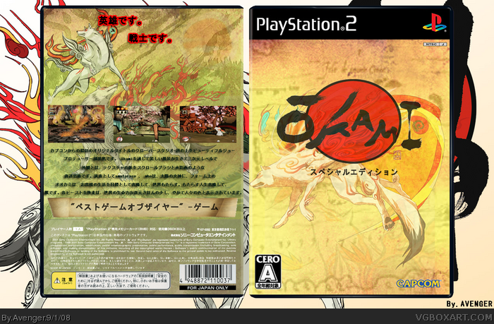
I think the screen shots should have some borders, or at least a stroke around them. Also, I think that the tagline should have a darker red stroke, because the bright red doesn't fit in that well. (You could just eye drop the red from the Okami logo and use that for the stroke color)
 Okami: Special Edition Box Cover Comments
Top right on back looks empty. But schweet.
[ Reply ]
please comment took awhile to do but I Liked making a Japanese box :)
[CLICK FOR FULL VIEW THANKS]
Edited at 1 decade ago
[ Reply ]
What should I put there?
[ Reply ]
dude, really great fav
[ Reply ]
Well I think, the God, hero, hunter savior part. Except however you do that in japanese lol
[ Reply ]
some comments would be nice
[ Reply ]
I think the screen shots should have some borders, or at least a stroke around them. Also, I think that the tagline should have a darker red stroke, because the bright red doesn't fit in that well. (You could just eye drop the red from the Okami logo and use that for the stroke color)
Other than that it's nice.
Edited at 1 decade ago
[ Reply ]
you wont get more comments just because you made a japanese box
logo seems a bit deformed and the text looks like it`s flying in the air and doesn`t belong to the box (change the outline and shadow)
[ Reply ]