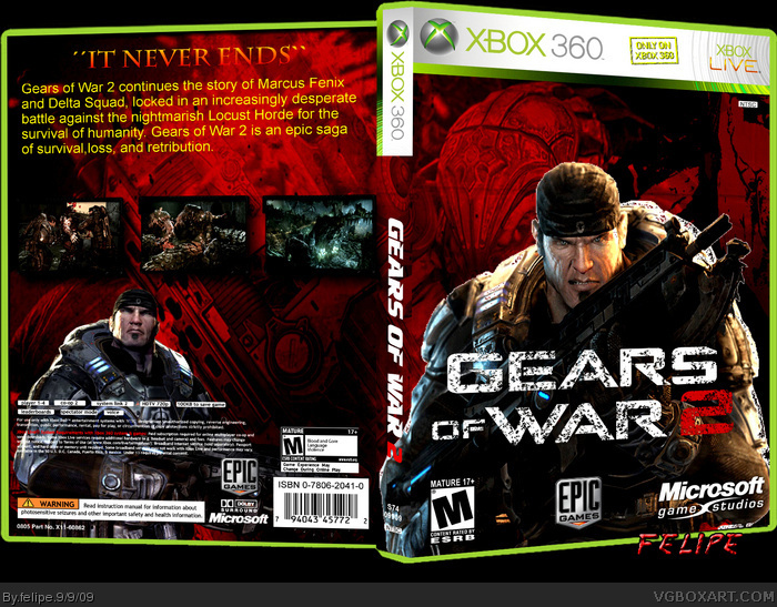
The front is actually really well put together. It's quite an official approach, however, the back lacks inspiration. The text on the back is (in my opinion) improperly aligned, I'd of gone with a center alignment rather than a left side one. Also, the font is bare and boring. Can I suggest Dafont for some nice font choices.
 Gears of War 2 Box Cover Comments
please, leave comments
[ Reply ]
The front is actually really well put together. It's quite an official approach, however, the back lacks inspiration. The text on the back is (in my opinion) improperly aligned, I'd of gone with a center alignment rather than a left side one. Also, the font is bare and boring. Can I suggest Dafont for some nice font choices.
You've got talent, keep at it.
[ Reply ]
Front is good, back needs more details and change font/color for description.
[ Reply ]