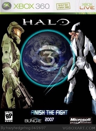
ok, plain as #2 said, the pics look strange, i think that =the guy has been slimmed. the box also says 2007 which is stupid because noone would care to know the date it was released, and you have the slogan "Finish the Fight" on the front when it would normally be on the back. the Earth with the Halo 3 symbol is quite good, but you cut off MC's legs, the Microsoft logo isnt cut our, the Bungie logo is a tad bit too small, and the ESRB logo is too small and you need to use a real one, not RP this game would be M like the rest of the series.
 Halo 3 Box Cover Comments
This is my first boxart ever i know its looks pretty poo cos of the background is plain so please be nice =).
[ Reply ]
I like the world effect, but, yea, the rest is a bit plain.
Sorry, but 3/5 for effort
[ Reply ]
ok, plain as #2 said, the pics look strange, i think that =the guy has been slimmed. the box also says 2007 which is stupid because noone would care to know the date it was released, and you have the slogan "Finish the Fight" on the front when it would normally be on the back. the Earth with the Halo 3 symbol is quite good, but you cut off MC's legs, the Microsoft logo isnt cut our, the Bungie logo is a tad bit too small, and the ESRB logo is too small and you need to use a real one, not RP this game would be M like the rest of the series.
[ Reply ]
i did say this was my first plus i made it whilei was college so not enough time to think, and be nice please =)
[ Reply ]